
A.I. Committed to Cancer Care
An AI-powered Precision Medicine platform designed to empower Oncologists and Molecular Biologists to accurately understand which treatment and prevention strategies are well suited for a patient’s particular disease.
Overview
IBM Watson Health wanted to make a difference in a cancer patient’s life by empowering health workers specifically in oncology, leveraging its A.I. capabilities for Precision Medicine.
This project is to redesign and improve the first MVP version after its first year of launching. The approach was a typical software development methodologies, where the PM led business-oriented improvements/defining the product, while I was in charge of elevating the user experience of the product to enhance its capabilities, partnered with tech leads to develop and release the next version.
Problem
The first Precision Medicine platform was designed by lead engineers in order for an MVP release.
After its first launch, clients provided feedback about multiple workflow problems resulting in inefficiencies, duplicates, and numerous delays. This resulted in consistent complaints, mistrust towards the product, and frustrations from all users.
Target users
• Primary users Molecular Biologists
• Secondary users Oncologists
My Role & Responsibilities
UX/UI Lead
UX Research
Design Strategy
Scope Design Timeline
Provide design support to the developer
Teammates & Collaborators
Product Manager
3 Engineers
4 Subject Matter Experts
Objective
Evolve and upgrade the product’s capabilities after a year in the field:
Review all clients’ feedback, determine and define improvements or changes
Aim for a second launch of the product after all improvements and enhancements are made.
Innovation
When a standard cancer treatment fails, patients will require personalized treatment or a clinical trial, that’s when they turn to personalized cancer care using Precision Medicine. Watson’s Precision Medicine can offer its A.I.’s quick extractions of insights from numerous amounts of unstructured medical literature, sequence the tumor, identify the cancerous cell, and map out a treatment to stop that mutated cell from growing.
While there are a lot of precision medicine platforms already in the market, our key differentiator is the speed and accuracy of our A.I. The A.I.’s strength lies in its fast analysis of large amounts of medical literature and tumor sequence, where the results are processed within days when traditionally, the process would take months.
Structure and scope
Our timeline was 3 months to fix all the usability issues, by first understanding the users, platform assessment, exploring solutions, performing user tests, and upgrading the visual UIs.
Empathizing with our users
With the help of the PM, he’d spoken to existing clients prior to me joining and gathered a collection of their feedback which he shared with me.
Using Simplified Personas
I created these personas minimally because I wanted to get to the point of what the users valued most, where their anxieties occur most, and their immediate priorities when they interacted with the platform.
General users’ sentiment:
Lots of Ambiguity: Molecular Biologists didn’t know they were duplicating the same uploads of a tumor file or generating the same reports. There’s no real understanding of how long the A.I. is processing once the files are uploaded.
Lack of Guidance: If there is an error state, they weren’t made aware immediately, of what to do next, why there is an error, or if they caused that error.
Inconvenient: There were two to three ways to upload and generate a report, which made them second guess which one to use. The PDF report can get up to 200 pages depending on the complexity of the patient, so the drugs that the oncologists need are hard to find.
Molecular Biologists

They have advanced knowledge of how cancer cells are structured. Relying on the speed of the A.I.’s fast research and mapping capabilities saves them time. The problem lies at the beginning of the uploading, resulting in inaccurate reports and wasted time during their review process.
Oncologists

Oncologists found the PDF report overwhelming and inconvenient when having to filter through to get what they need i.e. main mutating cells and the possible drug options that have the highest potential of efficacy (especially in rare cancers).

After consolidating all of the client’s feedback, I drew a simple journey map that highlighted the touchpoints of three people: the Molecular Biologist, the Oncologist, and the patient. This allowed me to see how they’re all connected, and see where/when the levels of frustrations happen, which was during the top five tasks of our primary users.
Platform assessment and audit
I wanted to experience myself what exactly they mean by errors and ambiguity. So I tested the platform myself and followed the workflow of our users from beginning to end.
I corroborated and understood our users' frustrations. A majority of the issues centered around basic UX in proper alerts, prompts, and notifications.
Audit:
I used the learnings from the client feedback and analytics to reframe the content so that it’ll provide a better value for the user i.e. efficiency.

Review UX & Use of Components:
Since this first MVP was launched without a designer, there were misuses of UI components and no UX in general. But I saw this as an opportunity to fix the friction.

Information (Re)Architecture:
After the audit, I restructured the content per user needs and increase efficiency giving users quick access and control.

Now that we know the problem and we’ve empathized with the users, how might we solve for error prevention, reduce duplication and customize printing a report?
Here are the key solutions that helped us achieve results.
01. Set expectations to users clearly and earlier on to reduce the amount of ambiguity
For setting expectations for users, I had to turn to some basic UX principles to provide guidance and context in order for them to be empowered.
BEFORE

Users have no clear understanding that a file had an issue, they would have to trigger the dropdown to see an analysis failed with only a red triangle icon and doesn’t clearly state what the issue would be.
AFTER

Allowing users to see the condition of their uploading project upfront helped set expectations: the progress, success state, informational (for systems timeout/wifi), and two error states (a corrupted file or issues with the A.I.). Also important to prompt users on what to do if there was an error and reassure them that they’re not at fault.
02. Duplications can be addressed at the beginning

A Case ID wasn’t coded to be a differentiator I thought it was a unique way to verify duplicates.
AFTER
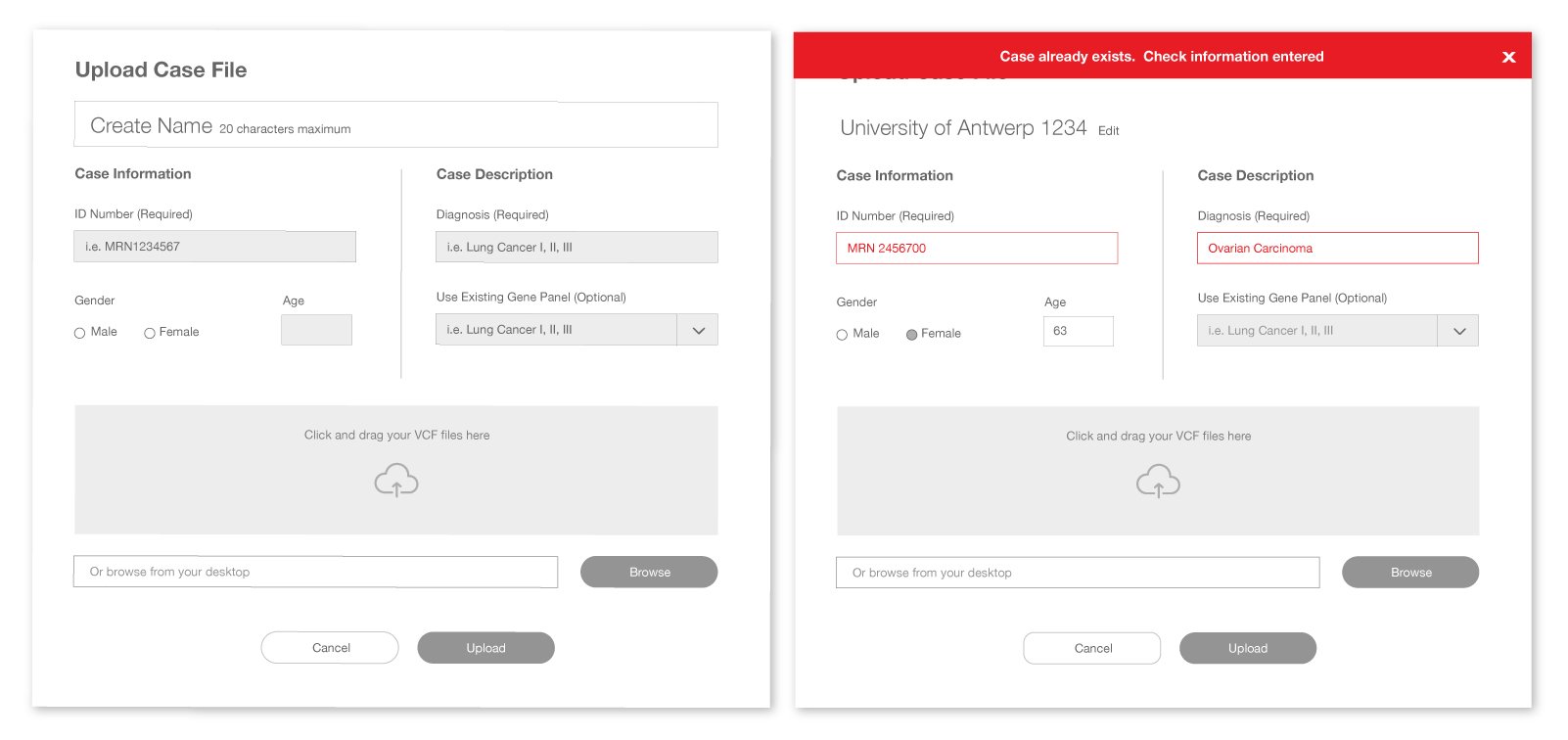
I made a rule to limit the character count to 20 max to better manage the cognitive recall when creating a name. I verified with users and dev teams if we’re able to use the ID number and Diagnosis together as cross-reference duplicate uploads.
04. Offer a way to customize the report when exporting for Oncologists
BEFORE
The UIs weren’t too intuitive when printing out the drug list for oncologists. When I was doing the audit, I had to guess what to do with the filter icon, and the selection boxes next to the drug names, then realized the file icon was meant to be the PDF download.

AFTER

I stripped down the number of filtering controls and made explicit visual cues to guide the user i.e. Download PDF Report button. From there they have an option of whether to include or exclude information depending on the complexity of the patient’s case, resulting in a more convenient report for Oncologists to read.
User validation
I prototyped the new features and improvements to test with five existing clients who volunteered their time. I needed to verify if the verbiage and copy I’m using are within their scientific vernacular.
They were very enthusiastic about the notifications, alerts, and customizable PDFs. They felt there wasn’t any more ambiguity and know what to do if an error occurred.
Additional requests were on the data visualization for more complicated patients with more than 10 mutations as an example. Due to the complexity of the information, the visualizations were messy and unclear. The next step was to solve the visuals after we’d solved the highlighted problems.
Visual Design
I leveraged what made sense from our existing like a grid, utility icons, colors, and fonts. I created additional UIs to our existing kit because the information is slightly different, and details such as mutating genes and content cards.

The content audit also helped open up the interface allowing for the eye to have some breathing room. Applying our existing grid from our design system created a good structure and visual hierarchy which helped for quick scanning.

The original circos diagram didn’t accommodate extreme cancer cases, I gave the circos graph its own page where users can zoom/out for a closer look which the original did not allow. This graph maps out a cancerous tumor’s genetic sequence (24 DNA/46 chromosomes) and shows which gene has mutated or caused the tumor, which helps in finding a targeted treatment.

The original circos diagram didn’t accommodate extreme cancer cases, which resulted in layers of information congealing together. As a solution, I gave the circos graph its own page in order to accommodate all sorts of extreme cancer cases, and the ability for users to zoom in/out. While additional content like targeted treatment is easily accessible but hidden with a sliding drawer.
Results and lessons learned
We released the new and improved features in beta phases which took a year and a half to release in full since there was a lack of dev resources. This decision was made by the PM in order to fix any bugs and test out every complexity of the different cancer cases. Ultimately I left the project after the phase of the release and was allocated to another product.
I learned that the smallest details like an error message and its context can impact a user’s experience immensely. For data visualizations like mapping all conditions of cancer, it’s important to know what those extremes are and design for them, not knowing this will break any design.