
A decision support platform powered by A.I. for medical professionals.
This product is designed to optimize a physician's clinical workflow, empowering them to make well informed decisions and focus on patient care.
Overview
Patient History is a cutting-edge decision support platform driven by artificial intelligence, tailored specifically for medical professionals. This product is meticulously crafted to enhance the efficiency of physicians' clinical workflows, enabling them to make informed decisions with confidence while prioritizing patient care.
By using historical data and leveraging advanced AI technologies, this medical platform empowers healthcare professionals with the tools necessary to optimize their decision-making processes, ultimately leading to enhanced patient outcomes and operational efficacy within medical practices.
Problem
The Electronic Medical Record (EMR) systems in the United States face challenges and inefficiencies. This is primarily due to a lack of standardization and interoperability, resulting in patient data being dispersed and critical insights trapped in different locations.
As a consequence, primary care physicians spend a significant amount of time navigating through EMRs instead of focusing on patient care.
Target users
Primary Users:
• Primary Care Physicians (doctors individuals see for regular check-ups).
Secondary Users:
• Specialists: i.e. oncologists who specialize in cancer, an endocrinologist who specialize in diabetes, etc.
• Nurses: work directly with patients and are responsible for all urgent care
My Role & Responsibilities
UX/UI Lead
Create and own design strategy
Define end-to-end experience
Scope Design Timeline
Provide design support to developers
Teammates & Collaborators
UX Researcher
Product Manager
2 Engineers
4 Subject Matter Experts (i.e. doctor, surgeon, nurses)
Objective
Research, Strategize and Design an end-to-end MVP that’s powered by Watson’s A.I. capabilities for physicians that are pressed for time.
Deliver an MVP within six months, set to pilot at a VA Hospital in South Florida.
AI Innovation
The goal of this project is to address these fragmented issues by leveraging Watson's A.I. technology, utilizing NLP, ML, and other advanced solutions to unify fragmented data, streamline processes, and ultimately improve patient outcomes and overall efficiency in care delivery
How the A.I. technology would work and be of use:
Leverage existing unique identifiers like DOB, MRN ID, and SSN, which are used to gather all associated data.
Using NLP, the AI can read and analyze in minutes within the context of a patient’s medical history.
Physicians will be presented with the information, saving them from time filtering through information they don’t need.
Structure and scope
Lacking knowledge about our users and the healthcare industry, I was uncertain about what success should entail. To address this, I created a project timeline and schedule, bringing structure to the team.
This facilitated a clearer view of our goals and milestones, enhancing anticipation, accountability, and preparedness. To gain insights into our user's motivations, I initiated a 3-day Design Thinking Workshop, involving healthcare Subject Matter Experts (SMEs) and available stakeholders.

Design Thinking workshop

The workshop gave us perspective on how to even begin and empathize with our users.
In attendance:
2 physicians
2 nurses
3 Engineers
3 Designers
2 UX Researchers
2 Front End
3 Product Owners
Workshop findings
Notable Quotes
“The more notes I find at a given timeframe, say six months to however far back, that’s a sign for me to investigate further… something major happened and it may be manifesting differently now.”
Dr. Mcarthy, Physician
“We only have 16-20 minutes per patient during annual checkups. I need to see their full medical history to understand what’s really going on with a patient, even if it’s an annual check up and seem healthy. I look through medical notes to see past orders, then I order any new tests if need be”
Dr. Senaite, Physician
High-Level Learnings
Time constraints: Physicians only have 16-20 minutes per patient during annual checkups, not enough to get a holistic understanding of a patient.
Medical Notes hold critical insights to piece together context about a patient: Both physicians and nurses need to understand the past story of their patients, looking for any pre-existing conditions in order to move forward by referencing Medical Notes. These notes have a timestamp of when it was written, who wrote it, and a detailed assessment of the patient, stored in EMRs.
Modern Devices: EMRs can be frustrating to operate and are not the same at every hospital. Interestingly enough, some hospitals are adopting tablet devices to help them facilitate admin work during their rounds.
User Journey
Physician’s Typical Workflow
To further empathize with the users, I mapped out the physician’s day-to-day using the learnings from the workshop.
Doing this allowed me to view where the top pain points are and when inefficiencies occur:
• Most time spent looking or searching for a medical note
• Then going on different screens searching or investigating
• When found, the information is incomplete or inaccurate

Information Architecture
Next, I analyzed and organized how our users like to digest information and categorize them based on their workflow/mental model.
What I learned that users value most:
An overview: at the point of contact, physicians need to review the latest vitals, blood pressure, and weight, and ask for any complaints.
Review last medical notes for critical insights and by which medical department i.e. ordered medication, by specialists, radiologists, etc.
A timeline of when notes were written, medications prescribed, etc.

“How Might We” through sketching
Based on our findings, a majority of a physician’s experience is all about data, time, historical documents, and a mass of medical notes on a digital screen when seeing a patient.
Sketching allowed me to explore design options, and visualize how physicians can get the full context of their patients:
What should an “overview” look like
Since physicians need to understand the past to help inform the future, how should they experience time?
How can designs accommodate all the complexity of human health i.e. healthy patients with minimal problems to patients with multiple conditions?
How to present medical notes so that they can easily access
Present digestible information for users that only have 20 minutes per patient
How should users experience complexity of mass, volume and time?
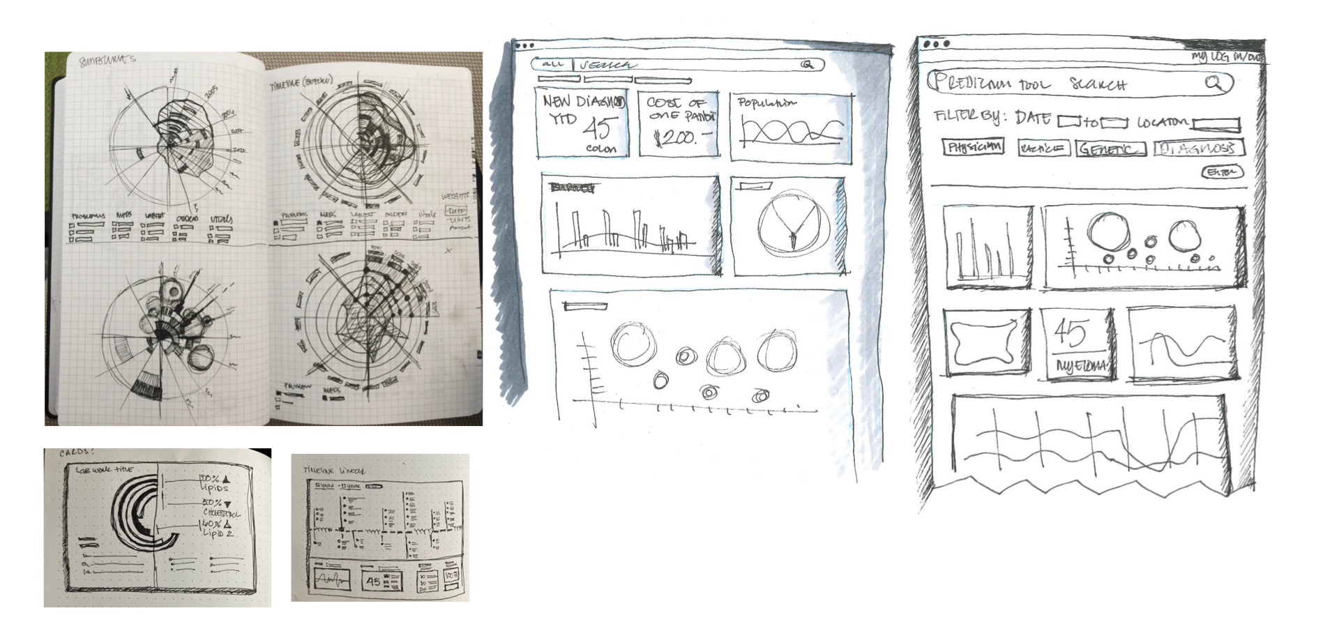
Wireframes
When it was time to wireframe, I wanted to see if there are other ways to convey a patient’s narrative clearly and understand how the interactions should be. I looked at timelines, many data visualizations, heat maps, and information cards if these components can tell a story.

User Testing
To test the most intuitive approach and swiftly present a comprehensive patient story to physicians, I developed three different directions using low-fidelity prototypes. These directions included designing a dashboard with statistics, a Sankey diagram, and a body heatmap to convey the information in varied ways.
Concept 1: Stats on a Dashboard
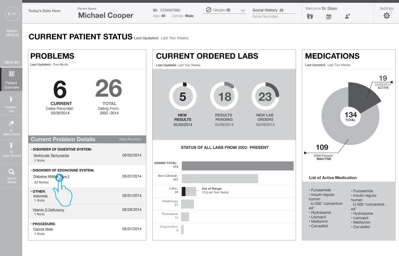
I like the stats on the problem list because I can tell right away if they’re healthy or improving, but I didn’t realize I could click on any of these and gets me to a timeline which took me awhile to realize the timeline is also clickable and another way to read a medical note.
Dr. Vanketesh, Physician
Concept 2: Sankey Diagram

“Seeing the largest mass of notes takes out the guess work when random cases come in. We get a lot of patients who are addicted to prescription drugs from past active duty injuries. Are they really in pain? Or they’re just looking for drugs… So I like that I can access the note of prescriptions and find out who wrote it, when, and the dosages...”
Dr. Mehas, Physician
Concept 3: Heat Map

“This is great, I can just scan an entire patient’s body and get an impression of how many problems they have and which one is the worst. Wow, I like this a lot… everything is in one place.”
Dr. Gregoryan, Physician
Validations and key learnings
Patient Overview: Users exhibit a preference for the heatmap feature, allowing them to visualize affected areas of the body and access notes promptly. In dealing with more complex cases, they find the heatmap approach less overwhelming compared to the Sankey diagram. Specifically, they express concern about the potential overwhelm caused by the "streaming" effect, especially for patients with multiple issues, such as concurrent heart disease and diabetes.
Visualizing Time and Mass of Notes: Physicians, when reviewing historical data, express reluctance to navigate through an interactive timeline with a customizable date feature. Instead, they favor a quick selection option for the last 6 months, 12 months, 3 years, and 5 years to track the effects of inherited diseases or social history (e.g., smoking or alcohol addiction). While they acknowledge the value of a detailed timeline for complex medical histories like cancer, diabetes, and heart disease, users desire a more simplified interaction.
Solving for Time Constraints: All three concepts address physicians' time constraints effectively. Both the Sankey diagram and Heatmap are adept at quickly assessing patients, reducing the time spent searching for notes, and have the potential to minimize duplicated orders.
Additional Request: Physicians express a desire for the AI to communicate any errors, missing data, or pending results in certain tests and provide a visual representation of how this information would be presented.
Finalizing and finessing visuals

From a visual standpoint, I moved forward with the heatmap concept since our users remarked that this approach can accommodate patients with more complex health concerns.
The challenges I faced with visual design:
• No robust design systems yet but except for good basic components i.e. fonts, color, buttons
• How should A.I.’s capability look and feel for physicians?
• I referenced some inspiration from film and how they’ve visually translated A.I. interaction
• The trick is to establish a balance between what’s fantasy and the A.I.’s role in healthcare
Evolving the Design System
I was able to contribute to our component library with new icons, status cards and new colors.

The unique feature of the platform would be the 3D interactive body of the patient.


Impact
Further improvements and lessons learned
While we met the MVP six-month delivery, the platform took three months to connect the data pipeline through the VA Hospital’s system and for the A.I. to train itself.
As physicians used the piloted product, there was some positive feedback. Having a consolidated overview and easy access to the notes, physicians were able to save at least 7 to 10 minutes within their original workflow. This gave them personalized time with their patients, less time searching/doing admin, and more time updating charts.
From what I heard there were some technical and functional issues that weren’t related to the design that caused some delays, but that was to be expected as businesses and partnerships wanted to test the AI'.s performance as part of this project.
For the visual and experience designs, there were some generational differences between doctors, who were open to using the platform. Those who have been practicing for over 50+ years thought it was too much for what they needed, though they appreciated the easy access to the notes, especially for imaging. While physicians who’ve been practicing for 10+ years, and grew up with technology, were quick to adapt and expressed enthusiasm
There were comments on the visual design and how the aesthetics for obese patients in 3D can be seen as offensive. The touch icons on the heat areas needed to be resized for touch and visibility. There were also new diseases and illnesses that our users wanted to visualize on the platform. I would have liked to evolve this product further, but however, I’ve moved on to another project and couldn’t follow through with the product’s lifecycle. Also, the business focused on exploring new ventures in healthcare i.e. oncology, precision medicine, clinical trials, etc.