This is Bishop
A Design System set up as a the preliminary structure (current company), to be used as a starting point for their marketing and product platform experiences.
Overview
Evolve the existing design system that only existed of a handful of basic components. The design team needed support in evolving their design system in order to be efficient in their process and keep up with a growing company. With this design system, we can also establish trust between our users using our products and our brand.
Problem
The existing components were incomplete when I arrived. There were only a collection of buttons with colors, some typography, and form fields, but nothing else.
Objective
Evolve the existing design system complete with rules and guidelines in order to provide structure and a sense of cohesiveness.
My Role & Responsibilities
UX/UI Lead
Teammates & Collaborators
1 Jr. Designer
1 Software Engineer
3 Product Designers
Deliverables
Component library and rules.
Approach
Creating a phased framework starting with an inventory and audit, and editing existing in order to evolve the design system.
Phase 1:
- Take inventory and audit
Phase 2:
- Establish foundational components and document rules
Phase 3:
- Accessibility
Audit Results
Lack of guidelines or rules while the basic building blocks of components to design products, there was no defined documentation anywhere on how to use them and why.
Inconsistencies as expected since it lacked other foundational components like grids, four different font styles, etc.
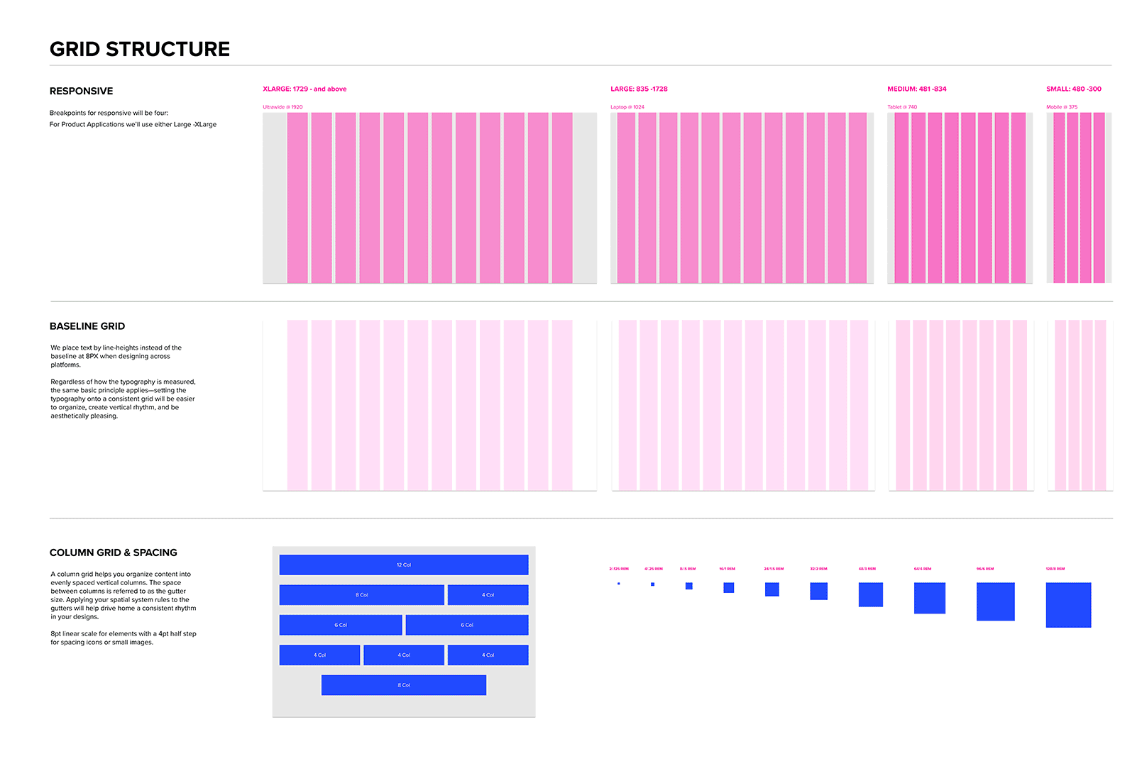
Responsive vs Non-Responsive Grids where we needed a responsive grid for public-facing sites but not necessarily for the enterprise products as they predominantly use desktops to process heavy data analysis.
Missing Accessibility Standards throughout the existing components and current products designed.
Foundations
Having the foundations will unite all components and give the much-needed structure to all our platforms.
01 Grid:
I introduced a typical 8pt grid with a 12-column grid with an 8px baseline. This grid system serves both our product and marketing platforms, providing a much-needed spatial rhythm in our layouts and dictating appropriate spacing.

02. Fonts:
I was able to determine the type of typestyles to use for marketing and product after the audit. I chose Proxima Nova as our font which we used in our branding and marketing assets.
Based on our content, I was able to create a type scale that worked consistently throughout platforms.

03. Colors:
Our original color palette did not meet accessibility guidelines. It was also a challenge to update a current color that was established seven years into the company’s original branding. Changes I had to make needed to be subtle and within the family hue of the original color.

04. Buttons:
When I arrived and uncovered during the audit, there were so many different types of buttons with all sorts of shapes and sizes. The lack of rules documented was the biggest factor in why there were many sizes of buttons used everywhere. I noticed that we only needed one size with a few variations.
04.01 Form Fields: The other biggest component to iron out for consistency where the form fields and their error messages.

05. Icons:
I noticed that we needed two sets of icons. One was for more utility aids in identifying user actions and another set as pictograms for marketing materials. I aimed for more simplistic styles for both.

Results
This preliminary set of components served as basic building blocks that provided order and much-needed structure for the design team to start building their designs. Designers are able to find the basic foundational components to begin designing a unified product and intuitive experiences. All components were created in Figma where we kept our assets in a component library and where I documented the rules.
Next Steps
I discovered that Design System especially for start-up companies is never done, as the company finds more opportunities for its product in different industries, this library is open to expanding.
Accessibility is next on the list to tackle and how that looks within the coded components. We are currently working on merging the coded components from Storybook to Figma so that developers and designers have a seamless way of working.
I’m also anticipating additional components that will be added to expand the library that will be reusable throughout product applications and marketing, i.e. navigation, skeleton load, footers, dropdowns, etc.
The goal is for Bishop to grow, evolve and establish itself as an essential tool for our company’s brand, and connect users to our products. We hope to launch Bishop publicly within a year, complete with a visual language, pattern guidelines, branding, and CSS framework.